
Support Center.
Get Started or Become a Pro. Browse our support articles to learn how to get the best out of PeopleGoal.
Reports for Pros
At PeopleGoal, we understand that every organization has unique reporting needs. Therefore, we offer not only a comprehensive suite of ready-made reports but also the capability to create custom reports tailored to your specific requirements.
Our report builder allows you to view every data point within an app, providing you the flexibility to analyze your data and draw critical business insights. To fully leverage this feature, ensure you have familiarized yourself with the structure of our data view and the process of creating a report template. You can find detailed guidance in the 'Reports' article located in the 'Getting Started' section of our resources.
This flexibility extends to data visualization as well. Our platform enables you to create a variety of charts from your data table, facilitating deeper understanding and more impactful presentations. Furthermore, to enhance efficiency and consistency, you can set up a regular recurring report schedule. This way, you'll never miss an update or overlook an emerging trend.
With PeopleGoal, you have all the tools you need to transform your HR data into actionable insights.
Standard PeopleGoal Reports
SMART Goals
- Goal Completion Report: Track the number and percentage of employees who have completed their SMART goals.
- Progress Report: Monitor the progress of each employee towards their respective goals.
- Goals Alignment Report: Check how individual goals align with team and organizational goals.
- Overdue Goals Report: Highlight goals that have passed their deadline without being completed.
- Goals Achievement Timeline: Show the timeline of goal achievement across teams or departments.
360 Feedback
- Feedback Completion Report: Track the number and percentage of employees who have completed their feedback tasks.
- Feedback Summary Report: Summarize the feedback received by each individual, including strengths and areas for improvement.
- Team Feedback Report: Present feedback trends and patterns at a team or department level.
- Comparative Feedback Report: Compare feedback across different time periods or between teams.
Performance Reviews
- Performance Rating Report: Outline the distribution of performance ratings across the organization.
- Performance Improvement Report: Identify individuals who have shown significant improvement in their performance.
- Performance Gap Report: Highlight discrepancies between self-ratings and manager ratings.
- Team Performance Report: Summarize the overall performance of each team or department.
DEI (Diversity, Equity, and Inclusion) Surveys
- Diversity Report: Present data on employee demographics (e.g., gender, race, age, etc.)
- Inclusion Report: Show trends or patterns in how inclusive employees feel the workplace is.
- Equity Report: Analyze pay equity, promotion rates, and other potential equity issues.
- DEI Progress Report: Track changes over time in DEI metrics.
Employee Onboarding
- Onboarding Completion Report: Track the number and percentage of new hires who have completed each onboarding task.
- Onboarding Satisfaction Report: Measure new hire satisfaction with the onboarding process.
- Onboarding Effectiveness Report: Analyze whether new hires are reaching performance expectations within the expected timeframe.
- Time-to-Productivity Report: Show how long it takes new hires to become fully productive in their roles.
These reports can provide actionable insights to guide decision-making and improve the effectiveness of your HR programs.
How to Create Custom Charts
To begin, open up an app and click on the Data view.
Charts help to visualize the item data submitted by users in the app. You can build charts on top of the data table, and keep all of your raw data visible below.
You can create charts on the full data view, or on one of the report templates you've created.
To select a different report, click on the Report name drop-down list and choose the report you want to work with. You can also choose to create a new report template here.
Click the Chart button, then select the chart type you'd like to create.
The chart type you use will depend on the type of data you've recorded and how you want it to be displayed. When you're getting started try to create one of each chart type to get to know their features and which elements they work best with.
Once you've selected a chart type, a blank chart will appear. Click the pencil icon in the far right to edit the data set(s).
Reorder charts
You can create as many charts as you'd like within your report. They'll generate in a recommended display, but you can drag and drop your charts to other positions. You can also resize the vertical and horizontal borders to change the chart size.
Click Save template to save your updates to this report.
Understanding Charts
Now that you know how to create and reorder charts, let's get into further detail about using the various types of charts.
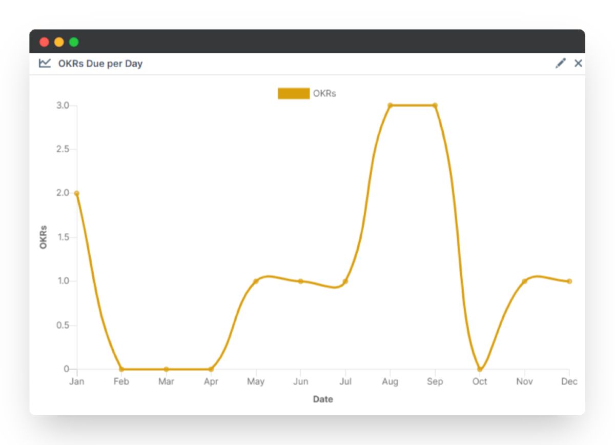
Line Chart
A Line Chart is great for tracking a variety of measures. Traditionally it is applied for monitoring change over time, for example the percentage completion of team goals over a quarter.
To set up a Line chart, click Chart and then New line chart.
Then go to the top right of the box that appears and select the pencil icon. From this next screen, you can configure precisely what data you would like to interpret. Within these settings, you can alter the timeframe used in your chart, along with the various parameters involved.
To select the data you wish to be entered on the Line chart, scroll down and select Add dataset. In the new dataset box that appears select the data element you would like to learn more about. You can add multiple datasets to the same chart for a cross-analysis.
In our example, we have created a projection for the cumulative progression of SMART goals created in the SMART Goals app. Over the course of time, as more and more participants set their goals, the chart will develop.
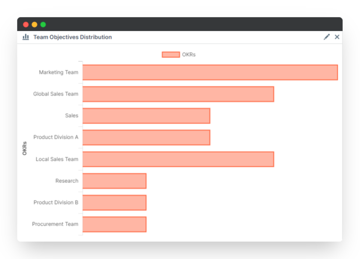
Bar Chart
A Bar chart is one of the most traditional formats for presenting data. The simple structure can be easily interpretted by any individual, provided you have a clearly defined x and y-axis.
To set up a Bar chart, click Chart and then New bar chart.
Then go to the top right of the box that appears and select the pencil icon. From this next screen, you can configure precisely what data you would like to determine. There are various options to alter how the bar charts will be displayed, you can edit based on your preferences.
To select the data you wish to be entered on the Bar chart, scroll down and select Add dataset. In the new dataset box that appears select the data element you would like to learn more about. You can add multiple datasets to the same chart.
If you would like to stack the charts on top of each other for a direct comparison, then be sure to toggle Stacked to on when you add additional datasets.
This is what we have done in our example. We have created a Bar chart that presents each participants responses grouped together to better understand how each individual has responded to the form.
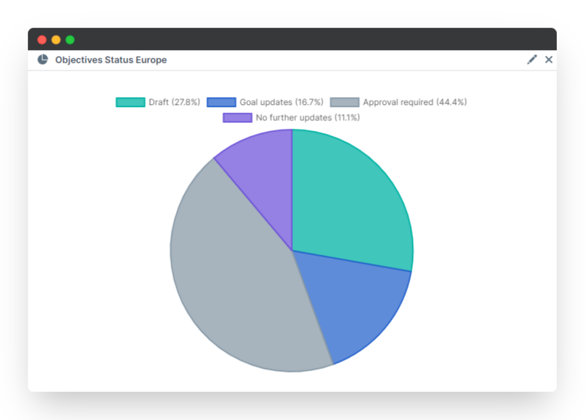
Pie Chart
The Pie chart is possibly one of the most recognizable formats for representing data. When using a pie chart, you are able to order all of your data points proportional to each other.
For example, you may want to establish how a team rated their overall performance in completing a project. This is what we have created in the image posted below.
To set up a Pie chart, select Chart and New pie chart to create the chart.
If you decide you would like to change the element that the Pie chart is presenting, then click on the pencil icon in the top right of the box.
Here you can change the title of the chart, add annotations or change the element. Using the drop down box, for Select element, you are able to change the data that will be presented in the Pie chart. Simply select the relevant point or question of interest and click Save changes.
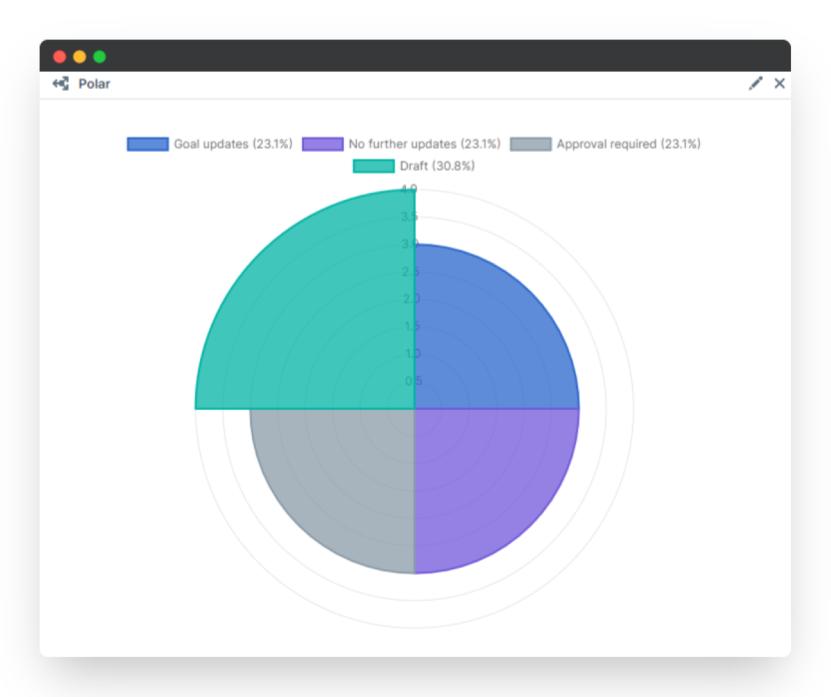
Polar Chart
Not to be confused with a Pie chart, the Polar chart provides an extra-dimension to the traditional Pie. Curated in a similar fashion, with proportional segments representing a specific data point, the Polar chart differs from the Pie chart due to the inflated nature of the segments.
A Polar chart will inflate each segment to a proportional size to demonstrate the population or responses of an element.
To set up a Polar chart, click Chart and then New polar chart.
Then go to the top right of the box that appears and select the pencil icon. From this next screen, you can configure precisely what data you would like to determine.
Whatever data you would like to display on the Polar chart, go to Select element and click on your desired element or question.
We've gone with the State element as our example. It presents a clear representation of how all participants are getting along with fulfilling their workflows and the colors can be altered to provide greater clarity on what each segment represents.
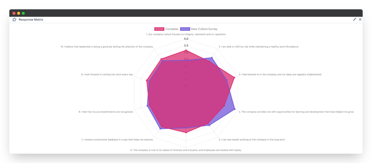
Radar Chart
A Radar chart, also known as a star chart, is a really helpful format for visualizing a comprehensive evaluation of your data. This vivid chart provides an intuitive description of data, whilst giving dynamic analysis.
To set up a Radar chart, click Chart and then New radar chart.
Then go to the top right of the box that appears and select the pencil icon. From this next screen, you can configure precisely what data you would like to determine. Be sure to select how you would like to group data by the question/ focus for this chart.
To select the data you wish to be entered on the chart, scroll down and select Add dataset. In the new dataset box that appears select the data element you would like to learn more about. You can add multiple datasets if you would like to stack the charts on top of each other for a direct comparison.
As always once you're done configuring your chart, select Save changes and enjoy your pretty chart.
The Radar chart is most effective when used to represent single select responses. This is what you can see in the example below for our analysis of Company Culture Survey reponses.
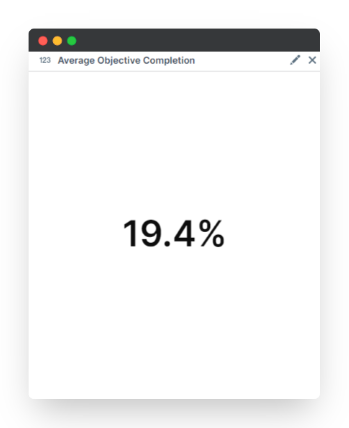
Metric Chart
The Metric chart is a great tool to present any calculations or numerical data. With a Metric chart, you are able to apply functions to your data. For example, you are can present the average or sum of a particular response or completion slider.
To set up a Metric chart, click Chart and then New metric chart.
Then go to the top right of the box that appears and select the pencil icon. From this next screen, you can configure precisely what data you would like to determine. Using the formula box, you can use the preset funcitons with your elements from the workflow to create any metrics.
In our example, we have created a formula to calculate the average goal progress for a specific team. Any users that look at the Data section will be able to see this projection, therefore indicating to them how well are performing in comparison to their peers.
Schedule Reports
Once you've saved a report template, you can schedule this report to run on a set schedule and notify selected recipients.
Open up the report template you want to schedule, then click Schedule report. This will pop open the Report Schedules view where you can see and edit existing report schedules.
Create a new scheduled report
Click Schedule new report.
Select your report frequency (daily, weekly, monthly or yearly) and the send interval (every 1 month as an example).
Choose the start date and time on which your first report will be sent.
You can optionally choose an end date, too.
Enter your recipients' email addresses in a comma-separated list. Everyone on this list will receive the scheduled report at the times and frequency you've created above.
Enter an optional message to go along with your notification email and report attachment.
Click Save report schedule to close.
Edit a scheduled report
Open up your app's Data tab, then click the Schedule report button.
A list of all scheduled reports will appear here.
Click Edit to change the report schedule details and add/remove report recipients.


PeopleGoal Support Team
Account Management & Implementation Specialists


