
When measuring employee performance, I see the same mistake again and again: companies either track everything that moves or almost nothing that matters. Neither approach works. One creates dashboard clutter. The other creates fuzzy reviews, confused managers, and employees who feel like they are being judged by vibes.
The fix is not more data. The fix is better employee performance metrics.
And by “better,” I mean metrics that tell you what happened, why it happened, and what a manager should do next. That is the real job of performance measurement. Not to punish. Not to police. To clarify, coach, and improve.
In this guide, I’ll walk through the most useful metrics for evaluating employee performance, show you employee performance metrics examples, and explain how to build a system that people can actually use.
Here’s what you’ll get:
- Key metrics to measure employee performance in a practical way
- Clear formulas, examples, and setup guidance for each metric
- A step-by-step way of creating metrics for employee performance without breaking trust
What Are Employee Performance Metrics?
Employee performance metrics are measurable signals that show whether employees produce the right results, at the right quality, in the right way, over time. The best metrics combine output, efficiency, behavior, learning, and business impact so managers can coach fairly, spot problems early, and improve performance continuously.
They turn day-to-day work into clear, trackable evidence instead of vague impressions. When used well, they create alignment between individual effort and broader business goals.
What Problems Do Employers Face When Tracking Performance?
Most employers do not fail because they care too little about performance. They fail because they measure it in messy, inconsistent, and overly subjective ways. The biggest problems are unclear expectations, weak metric design, poor manager capability, and review cycles that happen far too slowly.
That sounds blunt, but the research is pretty blunt too.
Gallup found that only 2% of the CHROs it surveyed strongly agree that their performance management system inspires employees to improve. In the same research, only 1 in 5 employees said their performance reviews are transparent, fair, or inspiring.
Gallup also found that only 47% of employees strongly agree they know what is expected of them at work, while 56% formally review goals with their manager once a year or less.
SHRM reported that 93% of respondents cited driving organizational performance as a critical objective for performance management, yet only 44% said their program had met that objective.
The same SHRM resource notes that 1 in 5 women and 1 in 4 men reported feeling emotionally overwhelmed by formal assessments.
McKinsey reports that 72% of employees cite goal setting as a strong motivator for performance.
It also found a huge difference between static review systems and active coaching systems: about 20% of respondents with no development conversations felt motivated by their company’s performance management, versus 77% among those who received ongoing feedback and development conversations.
And Gallup’s latest engagement data adds some urgency here: only 23% of employees worldwide are engaged at work.
So what problems do employers usually run into in real life? These ones.
| Problem | What It Looks Like in Practice | Why It Happens | What to Do Instead |
|---|---|---|---|
| Too many metrics | Teams track 20 numbers and act on none of them | Leaders confuse visibility with clarity | Limit each role to a handful of core metrics plus a few supporting ones |
| The wrong metrics | Employees optimize for speed and wreck quality | The scorecard only rewards one outcome | Pair every output metric with a quality or behavior metric |
| Subjective reviews | Two managers rate the same performance very differently | “Good performance” was never defined clearly | Write plain-language definitions and examples for each metric |
| Annual-only measurement | Problems sit untouched for months | Review cycles move more slowly than the work | Review metrics monthly, coach weekly, recalibrate quarterly |
| One-size-fits-all dashboards | Engineers, recruiters, salespeople, and support teams all get judged the same way | The system was built for admin ease, not job reality | Use a role-based framework with common design rules |
| Punitive use of data | Employees hide problems, game numbers, or stop experimenting | Metrics feel like surveillance | Use metrics for coaching, trend analysis, and fair decisions |
| Lagging-only metrics | Managers discover failure after the damage is done | The dashboard tracks outcomes but not early signals | Mix lagging metrics with leading indicators like check-ins, training, and trend data |
Here is the uncomfortable truth: bad measurement does not stay inside the performance process. It spills into engagement, retention, manager credibility, and customer outcomes.
That is the bad news. The good news is that most performance systems fail in predictable ways.
Before we move forward, here’s a quick video on the key performance management challenges and how to overcome them:
And when failure is predictable, design can be predictable too.
Now let’s get to the part everybody actually came for.
What Are the Key Employee Performance Metrics You Should Track?
The best employee performance management metrics fall into four buckets: goals and output, quality and efficiency, collaboration and development, and customer or risk impact. You do not need all of them for every role, but you do need enough balance to measure performance fairly.
Not every metric belongs in every job. That is normal. The goal is not to use every number here. The goal is to choose the right mix.
So before we begin, here’s a quick video for you to
1. Goal Completion Rate
Goal completion rate shows whether an employee finishes the goals they committed to in a set period. It sounds simple, but it is one of the clearest starting points in employee performance metrics because unfinished goals usually create a chain reaction: delayed projects, unclear accountability, and frustrating review conversations.
This metric is most useful when goals are specific, time-bound, and clearly owned by one person.
How to calculate: Completed goals ÷ Assigned goals × 100.
How to do it well:
- Define what “complete” means before the review period begins. A goal should not be marked complete just because someone “worked on it.”
- Break large goals into milestone-based outcomes so managers can see progress before the end of the quarter.
- Use written success criteria. For example, “Launch new onboarding survey in all three regions by June 30” is much better than “Improve onboarding.”
- Review goal status regularly, not just at the end of the cycle. Monthly check-ins make this metric far more useful.
- Separate blocked goals from neglected goals. If a dependency stalled the work, that matters.
Example:
A marketing manager starts the quarter with 10 agreed goals. These include publishing a new customer case study library, launching a webinar series, refreshing five product landing pages, and improving MQL handoff rules with sales.
By quarter-end, 8 goals are fully complete, 1 is partially complete because legal approval delayed publication, and 1 was dropped after the company changed priorities. If the company only counts fully completed goals, the employee’s goal completion rate is 80%. If blocked or deprioritized goals are reviewed separately, the discussion becomes far fairer and much more useful.
Watch out: Completion alone can reward people who choose safe, easy goals. Pair this metric with weighted goal attainment, so difficult, high-impact work gets the credit it deserves.
2. Weighted Goal Attainment
Weighted goal attainment improves on plain completion rate by recognizing that not all goals matter equally. Finishing a low-value admin task should not count the same as leading a product launch, reducing churn, or fixing a critical process issue.
This metric is especially useful in leadership, project, and strategic roles where one major outcome can matter more than five smaller tasks.
How to calculate: Total weight of achieved goals ÷ Total goal weight × 100.
How to do it well:
- Assign weights before the cycle starts, not after results are known.
- Keep total goal weight at 100 so the score is easy to understand.
- Give heavier weights to goals with bigger business impact, higher difficulty, or stronger alignment to strategic priorities.
- Limit the number of weighted goals so the system stays understandable.
- Document why a goal has a certain weight. That reduces debates later.
Example:
A people operations manager has five goals for the quarter. Rolling out a new performance review process is weighted at 35, improving manager training completion is weighted at 20, launching a pulse survey is weighted at 15, updating documentation is weighted at 10, and cleaning up older HR templates is weighted at 20.
By the end of the quarter, the manager completes the first three goals and partially completes the documentation update, but the template cleanup slips. That means they achieved goals worth 70 out of 100 weighted points. Their weighted goal attainment is 70%, which gives a much more realistic picture than a simple “3 out of 5 goals complete.”
Watch out: If managers can increase or reduce goal weights mid-cycle without a clear rule, this metric quickly becomes a fairness problem.
3. KPI Attainment Rate
KPI attainment rate tracks whether employees hit the concrete numerical targets tied to their role. These might include sales quota, average resolution time, fill rate, defect thresholds, client retention, or project margin.
It is one of the most practical metrics to measure employee performance when the role already has clearly defined business outcomes.
How to calculate: KPIs achieved ÷ Total KPIs assigned × 100.
How to do it well:
- Only include KPIs that the employee can realistically influence.
- Keep the KPI list short. Too many KPIs weaken focus and make trade-offs invisible.
- Make sure every KPI has a clean formula, data source, and review cadence.
- Mix result KPIs with at least one quality or behavior measure so performance does not become robotic.
- Review misses in context. Missing one KPI due to a territory shift is not the same as missing it due to poor execution.
Example: A recruiter is measured on three KPIs: time-to-fill under 35 days, offer acceptance above 90%, and hiring manager satisfaction above 4.5 out of 5. In one quarter, the recruiter fills roles in 31 days on average and earns a 4.7 satisfaction score, but offer acceptance falls to 84% because several finalists drop out over compensation.
The recruiter hits 2 out of 3 KPIs, so KPI attainment is 66.7%. That score is helpful, but the full story only becomes clear when the manager also looks at market conditions, candidate quality, and salary approval delays.
Watch out: This metric can become overly mechanical if you ignore judgment, collaboration, and role complexity.
4. Output Volume per Employee
Output volume per employee measures how much work someone produces over a period. It works best in roles with countable, repeatable outputs, such as calls handled, claims processed, orders packed, cases closed, reports completed, or articles published.
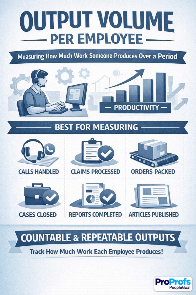
It gives managers a straightforward sense of throughput, but it should never stand alone.
How to calculate: Total completed units in a defined period.
How to do it well:
- Define the “unit” clearly. A closed ticket, for example, should mean the same thing across the team.
- Normalize output for shift length, territory, workload mix, or case complexity where necessary.
- Pair this with a quality metric such as error rate, audit score, or rework rate.
- Use trends across time instead of one-off spikes.
- Separate high-volume simple work from lower-volume complex work so comparisons stay fair.
Example:
A customer support rep closes 380 tickets in a month, while another rep closes 260. At first glance, the first rep looks stronger. But a closer look shows the first rep mostly handled basic password resets and shipping questions, while the second rep handled technical escalations that took longer and required coordination with engineering.
In that case, raw output volume helps, but it should be segmented by case type or weighted by complexity before being used in performance discussions.
Watch out: Volume without quality is how companies accidentally reward rushed, sloppy work at scale.
5. On-Time Delivery Rate
On-time delivery rate measures whether an employee completes work by the agreed deadline. It matters because missed deadlines create friction for everyone downstream: managers, teammates, customers, and cross-functional partners. In project work especially, one late deliverable can quietly stall an entire chain of activity.
How to calculate: On-time tasks or deliverables ÷ Total tasks or deliverables × 100.
How to do it well:
- Set deadlines in writing and make sure they are realistic.
- Separate employee-caused delays from delays caused by dependencies, approvals, or changing scope.
- Track the original due date and revised due date if timelines move.
- Use milestone dates for larger projects instead of waiting for a final delivery date.
- Pair this with quality, so employees do not rush unfinished work just to look punctual.
Example: A project coordinator owns 20 milestones across a system rollout, including vendor follow-ups, status reporting, user testing schedules, and training logistics. By quarter-end, 18 milestones are completed on or before the agreed date.
One slips because the coordinator missed a needed approval request, while the other slips because a vendor missed its delivery timeline. The coordinator’s raw on-time delivery rate is 90%, but the manager should separate controllable and uncontrollable delays before using that number in a formal review.
Watch out: Do not punish employees for delays driven by scope changes, missing inputs, or late approvals outside their control.
6. Value Contribution per Employee
Value contribution per employee measures the financial impact of an employee’s work. Depending on the role, that could mean revenue generated, margin protected, cost savings created, billable value delivered, or portfolio contribution managed.
This is one of the most powerful employee performance management metrics when the link between effort and business value is clear.
How to calculate: Chosen value measure ÷ Employee or team, depending on the role design.
How to do it well:
- Choose a value measure that actually fits the role. Revenue works for sales; cost savings may work better for operations.
- Use gross margin or contribution value instead of top-line revenue when profitability matters.
- Attribute shared value carefully in team-based work.
- Compare employees within similar contexts, not across totally different markets or customer segments.
- Add context notes when external conditions affect value generation.
Example:
A consultant delivers $85,000 in billable work in one month. That looks strong on its own, but the richer story comes from breaking it down further: $60,000 came from a planned client project, $15,000 came from an upsell opportunity the consultant identified, and $10,000 came from urgent advisory support completed in a tight window.
That kind of breakdown tells a manager more than a single number ever could. It shows not just the value created, but how the employee created it.
Watch out: For support roles and enabling functions, use value proxies very carefully so you do not undervalue essential work that is not directly revenue-linked.
You can already see the pattern here. Output metrics matter, but they get misleading very quickly when they live on their own.
That is exactly why quality and efficiency metrics matter so much.
7. Quality Score
Quality score answers one very important question: how good was the work? This metric keeps a performance system from becoming obsessed with speed and volume alone.

It works across many job types because almost every role has some version of quality, whether that means accurate reports, helpful customer calls, clean code, compliant paperwork, or polished design work.
How to calculate: Check the audit score, rubric score, checklist score, or accepted-work percentage.
How to do it well:
- Define quality criteria in plain language so employees know what “good” looks like.
- Use a standard rubric with clear scoring levels.
- Calibrate reviewers together to keep scoring consistent across managers or auditors.
- Sample enough work to make the score meaningful.
- Review both the score and the reasons behind deductions so coaching stays practical.
Example: A support team audits 20 customer calls per rep each month using a 100-point rubric. The rubric includes greeting quality, issue diagnosis, compliance wording, clarity of next steps, and customer empathy.
One rep averages a quality score of 91. That sounds excellent, but the detailed audit notes show repeated deductions for not confirming understanding before ending the call. That is gold for coaching because it turns a score into a clear improvement action rather than a vague “do better.”
Watch out: If different auditors apply different standards, the score stops being a quality metric and starts becoming a politics metric.
8. Error Rate
Error rate measures how often work contains mistakes. It is especially useful in jobs where accuracy protects time, trust, compliance, or customer experience. In finance, operations, support, logistics, payroll, and data-heavy roles, this metric can reveal weaknesses that raw output numbers completely miss.
How to calculate: Number of errors ÷ Total outputs × 100.
How to do it well:
- Define what counts as an error before measurement begins.
- Classify errors by severity so tiny mistakes do not carry the same weight as high-risk failures.
- Review root causes, not just totals. Errors can come from training gaps, unclear instructions, or broken systems.
- Track repeat error patterns over time.
- Use this alongside volume to avoid penalizing higher-performing employees unfairly without context.
Example:
A finance associate processes 300 invoices in one month. Six contain errors: two have incorrect tax coding, one has a duplicate payment risk, and three have smaller data-entry mistakes. That creates a 2% error rate.
But the smarter conversation does not stop there. If the serious errors came from a recent process change that was poorly documented, the coaching focus should partly shift from employee accuracy to process clarity and training support.
Watch out: Do not count the same issue twice if it appears in multiple systems or triggers multiple alerts.
9. Rework Rate
Rework rate measures how much supposedly finished work has to be redone. It is one of the most revealing quality metrics because it captures work that looked done on the surface but was not truly right. High rework usually means wasted time, hidden inefficiency, or unclear expectations somewhere in the process.
How to calculate: Items reworked ÷ Total completed items × 100.
How to do it well:
- Define rework clearly. Correcting a preventable error is rework; adding a new client-requested feature usually is not.
- Track where rework originates: missed requirements, poor handoffs, rushed output, or lack of skill.
- Review rework by type so you can spot recurring patterns.
- Pair rework data with quality score and deadline pressure.
- Use rework in coaching conversations as a process diagnostic, not just an employee judgment.
Example: A design team completes 80 creative assets in a month. Twelve of those assets need substantial revision because the original deliverables missed brand standards, contained the wrong dimensions, or ignored the approved brief. That puts the rework rate at 15%. On paper, that looks like a design quality problem.
But when the team reviews the work, they discover that half the rework came from incomplete intake forms and last-minute stakeholder changes. That changes the solution from “designers need to work harder” to “the briefing process needs fixing.”
Watch out: High rework may reflect poor briefs or weak upstream planning, not weak individual performance.
10. Productivity per Labor Hour
Productivity per labor hour measures how much useful output an employee generates for each hour worked. It is more nuanced than raw output because it accounts for time.

This makes it especially useful in frontline, warehouse, operations, and service environments where different employees may work different schedules or shift lengths.
How to calculate: Total output ÷ Hours worked.
How to do it well:
- Only compare like-for-like work. Different task types can distort the picture.
- Use productive hours where possible instead of total paid hours if that better reflects actual work time.
- Segment results by complexity, shift conditions, or route difficulty when relevant.
- Pair productivity with quality and safety so speed does not become the only target.
- Review trends over time, not just peak days.
Example:
A warehouse employee picks 420 items in a seven-hour productive window. That equals 60 items per hour. Another employee picks 350 items in the same timeframe, which looks weaker until you notice they were assigned bulk items stored across wider warehouse zones.
Without context, this metric can punish the wrong person. With good role design and fair task normalization, it becomes a strong indicator of efficiency.
Watch out: Pushing this metric too aggressively can encourage shortcuts, injuries, poor quality, and burnout.
11. Task Cycle Time
Task cycle time measures how long work takes from start to finish. This metric is useful for spotting bottlenecks, workload problems, training gaps, and process design flaws. It is especially helpful in operational and knowledge-work settings where speed matters, but not at the expense of correctness.
How to calculate: End time − Start time, then average across similar tasks.
How to do it well:
- Measure comparable work types separately so complexity does not distort averages.
- Define clear start and end points in the workflow.
- Look at median time as well as average time if outliers are common.
- Review cycle time alongside quality and rework.
- Use this metric to diagnose process friction, not just employee pace.
Example:
An analyst completes standard monthly reporting packs in an average of 3.2 days. At first, the metric looks stable. But after segmenting the data, the manager sees that simple reports average 1.5 days while more complex regional reports take over 5 days.
That reveals a training gap around a specific reporting model rather than a general productivity issue. In this case, cycle time becomes a coaching tool and a process-improvement tool at the same time.
Watch out: Faster is not automatically better. A short cycle time with poor accuracy is just a fast failure.
12. Utilization Rate
Utilization rate shows how much of an employee’s available working time goes into productive, billable, or otherwise value-generating work. It is common in consulting, agencies, project-based teams, and professional services.
Done well, it helps managers understand capacity and workload balance. Done badly, it turns into a bizarre contest in looking busy.
How to calculate: Productive or billable hours ÷ Available hours × 100.
How to do it well:
- Define “productive” carefully and consistently.
- Avoid rewarding fake busyness or excessive time logging.
- Set realistic target ranges rather than chasing maximum utilization.
- Review utilization with quality, margin, and wellbeing indicators.
- Consider role differences. Senior staff may spend more time mentoring, planning, or selling work.
Example:
A consultant has 35 available working hours in a week after excluding leave and internal admin time. They bill 28 of those hours to client work, giving them an 80% utilization rate. That may look excellent.
But if the consultant is consistently running at 95% or above for several months, the organization should not celebrate too quickly. That can signal overload, weak staffing, and no room for learning, internal improvement, or relationship-building work.
Watch out: Extreme utilization can be a warning sign of overload, not high performance.
13. SLA (Service Level Agreement) Adherence
SLA adherence measures whether work is completed within agreed service-level commitments. In support, IT, service desks, and internal operations, this metric gives managers a very practical way to assess reliability and responsiveness. It matters because service promises shape trust.
How to calculate: Tasks completed within SLA ÷ Total tasks × 100.
How to do it well:
- Separate requests by priority level so the metric reflects reality.
- Define whether the SLA applies to first response, full resolution, or both.
- Exclude cases delayed by customer inactivity or approved pauses where appropriate.
- Pair SLA adherence with customer satisfaction and quality.
- Review misses by reason code, not just the total count.
Example:
An internal IT support specialist handles 100 tickets in a month. The team SLA requires critical issues to be resolved within two hours and standard issues within one business day. The specialist completes 94 tickets within the correct SLA window, giving them 94% adherence.
That sounds strong, but a closer review shows that most misses were on high-priority issues tied to one recurring network problem. The performance discussion should therefore include both the employee’s handling of urgent cases and the broader technical bottleneck affecting turnaround.
Watch out: Employees may chase SLA timing at the expense of real resolution quality if this metric is used in isolation.
14. Attendance and Punctuality Reliability
Attendance and punctuality reliability measures whether employees show up as expected and on time. In shift-based, customer-facing, and operational roles, this is not a side issue. It directly affects service, staffing, workload fairness, and team morale.

Reliability is part of performance when the job depends on physical presence or timely coverage.
How to calculate: On-time attendance events ÷ Total scheduled attendance events × 100.
How to do it well:
- Separate approved leave from avoidable lateness or absence.
- Use clear attendance rules that employees understand from the start.
- Track patterns, not isolated incidents.
- Review underlying causes before judging the metric harshly.
- Use this alongside productivity and quality so the conversation stays balanced.
Example:
A retail supervisor is scheduled for 48 shifts in two months and arrives on time for 46 of them, creating a reliability rate of 95.8%. That is generally strong. But if the two late arrivals both happened on peak trading days and caused coverage issues at opening time, the impact may be larger than the percentage suggests.
Equally, if those late arrivals were tied to a documented transport disruption, the manager should respond very differently than if the lateness reflected repeated poor planning.
Watch out: Use context. Penalizing genuine illness or caregiving challenges without judgment harms nobody and erodes trust quickly.
15. Process Compliance Rate
Process compliance rate measures whether employees follow required procedures, documentation steps, or policy rules. This is essential in regulated industries, safety-sensitive work, finance, healthcare, and any environment where “mostly right” is not good enough. It protects consistency, risk control, and audit readiness.
How to calculate: Compliant actions ÷ Total required actions × 100.
How to do it well:
- Define must-have steps in plain, auditable language.
- Use consistent sampling and audit methods.
- Separate critical compliance failures from lower-risk misses.
- Review why non-compliance happens: unclear process, lack of training, or deliberate shortcuts.
- Keep documentation current so employees are not judged against outdated rules.
Example:
A lab technician is audited across 100 required actions over a review period, including labeling, sample handling, recordkeeping, and sanitation procedures. They complete 97 of those actions correctly, resulting in a 97% compliance rate.
That looks high, but if the 3 missed actions involve chain-of-custody documentation, the conversation should focus on severity, not just percentage. This is why process compliance works best when it combines a quantitative score with clear risk weighting.
Watch out: Do not confuse box-ticking with strong performance overall. Compliance matters, but it is not the whole story.
So far, we have covered what employees deliver and how well they execute it.
But performance is never just output plus accuracy. People work with people, and that changes everything.
16. 360 Feedback Score
A 360 feedback score captures how others experience an employee’s work. It is especially valuable for managers, team leads, project owners, and knowledge workers whose impact depends heavily on communication, influence, and consistency. This metric helps surface behaviors that raw output data can never show.
How to calculate: Average structured feedback score from manager, peers, direct reports, or relevant stakeholders.
How to do it well:
- Use behavior-based questions, not vague personality judgments.
- Ask only people who regularly work with the employee.
- Keep the questionnaire focused on observable behaviors.
- Review patterns across raters instead of overreacting to one harsh score.
- Use narrative comments carefully and tie them back to structured categories.
Example:
A team lead receives feedback from their manager, four peers, and five direct reports. The questions cover reliability, clarity, listening, delegation, follow-through, and conflict handling. The lead averages 4.3 out of 5.
That is a useful headline number, but the real value comes from the pattern underneath it: peers rate collaboration highly, while direct reports note that priorities sometimes shift without enough explanation. That gives the manager a very specific coaching path instead of a fuzzy “improve leadership” message.
Watch out: Never rely on anonymous comment piles without structure. That turns feedback into a popularity contest in better stationery.
17. Collaboration Score
Collaboration score measures how well an employee works across teams, functions, and shared priorities. In many modern roles, collaboration is not a soft extra. It is central to getting the job done. This metric helps organizations measure the quality of handoffs, communication, and cross-functional execution.
How to calculate: Average rubric score from key collaborators based on defined behaviors.
How to do it well:
- Use a simple rubric with behaviors like responsiveness, handoff quality, planning, and conflict management.
- Ask only frequent collaborators for input.
- Measure collaboration in recurring workflows, not just general sentiment.
- Separate healthy challenge from unhelpful friction.
- Use examples alongside scores so employees can act on the feedback.
Example:
In a product team, engineering, design, and product management each rate collaboration once per sprint. One product manager scores highly for clarity of priorities and planning discipline, but lower for late requirement changes.
The collaboration score helps reveal that the person is not broadly “bad at teamwork”; they have one specific habit that makes handoffs harder for others. That is exactly the kind of specificity this metric should create.
Watch out: Collaboration should not mean constant agreement. Good collaborators can still challenge ideas strongly and score well.
18. 1:1 Action Completion Rate
1:1 action completion rate measures whether commitments made during manager-employee check-ins actually happen. It is one of the most useful leading indicators in a performance system because it tells you whether coaching is turning into action. It also quietly reveals whether the manager is setting clear follow-ups.
How to calculate: Actions completed from check-ins ÷ Total actions agreed × 100.
How to do it well:
- Keep actions small, specific, and time-bound.
- Write down actions during or immediately after the 1:1.
- Assign ownership clearly if an action belongs to the manager, the employee, or both.
- Review open actions at the start of the next check-in.
- Use this metric to improve coaching rhythm, not just employee discipline.
Example: Over one month, a manager and employee agree on nine actions during weekly 1:1s. These include sending a Friday project update, shadowing two client meetings, reviewing one dashboard before the next check-in, and drafting a process improvement proposal. By the end of the month, seven of those actions are completed.
The completion rate is 77.8%. That number is useful, but the richer insight is whether the missed actions were too vague, too large, or blocked by something external.
Watch out: This metric reflects the quality of the coaching relationship too, not just the employee’s follow-through.
19. Recognition Quality or Frequency
Employee recognition quality or frequency measures whether employees receive meaningful acknowledgment for valuable work. This is not about handing out gold stars for breathing near a keyboard. Done well, it shows whether strong work is visible, specific, and reinforced in the culture.

How to calculate: Count meaningful recognitions tied to real contributions, or score the quality of recognition using a simple rubric.
How to do it well:
- Track recognition that names a specific contribution, not generic praise.
- Measure patterns over time rather than one-off moments.
- Consider role visibility so quieter jobs are not ignored.
- Use recognition as a supplement, not as proof of performance on its own.
- Encourage peer and manager recognition where appropriate.
Example:
A team member receives four recognitions in a quarter. One thanks them for staying late to solve a customer issue, one credits them for improving onboarding documentation, one highlights their calm handling of a difficult project handoff, and one notes their support in training a new hire.
That is far more meaningful than four vague “great job” comments. When recognition is detailed and linked to specific work, it can reinforce the exact behaviors the organization wants more of.
Watch out: Do not turn this into a vanity metric. Some teams are simply more public or expressive than others.
20. Training Completion Rate
Training completion rate measures whether employees complete the required or assigned learning. It is especially useful in employee onboarding, compliance, role transitions, and regulated environments. This metric matters because training is often the bridge between expectations and capability.
How to calculate: Completed training items ÷ Assigned training items × 100.
How to do it well:
- Separate mandatory training from developmental learning.
- Set deadlines that are realistic and role-relevant.
- Track completion status clearly and consistently.
- Review completion in context with workload and manager support.
- Pair completion data with observed skill application when possible.
Example:
A new hire is assigned 12 onboarding modules in their first 30 days, including system basics, process walkthroughs, security rules, and service standards. They complete all 12 on time, producing a 100% training completion rate.
That is a strong sign of follow-through, but the manager should still check whether the employee can apply the training in real tasks. Completion tells you the course was finished. It does not tell you the learning actually landed.
Watch out: Completion does not prove competence. Pair this metric with skill growth, observation, or quality measures.
21. Skill Growth Score
Skill growth score measures whether an employee’s capability improves over time. This makes it especially valuable in roles where employee development matters as much as current output, such as early-career positions, technical specialists, managers, and employees preparing for a larger scope.
How to calculate: Compare role-based proficiency levels across two or more points in time.
How to do it well:
- Use a clear skills rubric with defined proficiency levels.
- Focus on critical skills, not a giant library of loosely relevant ones.
- Calibrate managers so one team does not rate far more generously than another.
- Review both progress and evidence behind the score.
- Link growth conversations to stretch work, coaching, and training plans.
Example:
An analyst is assessed on stakeholder communication, data storytelling, dashboard design, and business judgment. At the start of the half-year, they are rated level 2 in stakeholder communication, meaning they can explain work clearly when asked but struggle to drive proactive updates.
Six months later, they are rated level 3 because they now lead update meetings, tailor communication to different audiences, and flag risks early. That growth matters because it shows expanded capability, not just static output.
Watch out: Without calibration, every team invents its own rating universe and the metric becomes hard to trust.
22. Innovation Contribution Rate
Innovation contribution rate tracks useful improvement ideas that were actually adopted or implemented. It is not about endless suggestion-box noise. It is about practical improvements that make work better, faster, safer, cheaper, or more effective.
How to calculate: Implemented or adopted improvement ideas per employee or team over a set period.
How to do it well:
- Count only ideas that lead to a real change, not just a suggestion.
- Define what qualifies as improvement: speed, cost, quality, employee experience, customer experience, or risk reduction.
- Track small improvements too, not just flashy breakthroughs.
- Review innovation within similar job families.
- Capture both the idea and the result so contribution is visible.
Example:
An operations employee notices that one picking route causes unnecessary backtracking in the warehouse. They propose a revised routing sequence, test it with a supervisor, and the team adopts it.
Over the next month, average pick time drops by 8%. That should absolutely count as innovation contribution because it moved beyond talking and produced a measurable gain. This metric works best when the organization values practical improvement, not theater.
Watch out: Some roles naturally produce more visible ideas than others, so compare within context.
23. Knowledge-Sharing Contribution
Knowledge-sharing contribution measures how much an employee helps other people perform better by creating reusable knowledge. This includes playbooks, SOPs, internal training, troubleshooting guides, templates, and practical documentation. It is a powerful metric in scaling teams because it captures multiplier value.

How to calculate: Count useful reusable knowledge assets or sessions created and adopted by others.
How to do it well:
- Only count assets that others actually use.
- Track whether the content solved a recurring problem or reduced repeat questions.
- Give more credit to reusable, high-impact resources than low-value documentation clutter.
- Review this metric in roles where coaching, scaling, or process maturity matters.
- Pair the count with a quality or adoption check.
Example:
A senior support rep creates three troubleshooting macros, one escalation guide, and a short training session for newer team members. Over the next quarter, the macros are used across dozens of tickets, and the guide becomes part of the team’s onboarding materials.
That is a real knowledge-sharing contribution because it improves team performance beyond the individual’s own ticket queue. The key is not the count of assets. The key is whether the work became useful and reusable.
Watch out: Quantity is not quality. One excellent playbook can be worth more than ten ignored docs gathering dust in a folder.
This is where a lot of companies stop. They measure internal execution and call it a day.
But employees do not work in a vacuum. Their work affects customers, risk, and future readiness, too.
24. Customer Satisfaction Score
Customer satisfaction score, often measured as CSAT, captures how customers felt about the experience they received. For customer-facing roles, it deserves a place in the scorecard because it links performance to real-world impact.
It is especially useful in support, account management, customer success, retail, hospitality, and service operations.
How to calculate: Average post-interaction satisfaction score tied to the employee, team, or case.
How to do it well:
- Use enough survey volume before judging individual performance.
- Tie responses to specific interactions where possible.
- Review open comments as well as the average score.
- Segment scores by customer type or issue complexity if needed.
- Pair CSAT with resolution quality so employees do not optimize for niceness alone.
Example:
A customer success manager receives 38 completed surveys in a month and averages 4.7 out of 5. That is a strong result, but the detail matters. The highest ratings come from proactive update calls and fast issue coordination, while a few lower scores mention confusion around implementation timelines.
That gives the manager a practical coaching point: keep the relationship strength, improve expectation-setting. This is what makes CSAT useful. It shows not just whether customers were happy, but where the experience can be sharpened.
Watch out: CSAT can reflect pricing, policies, product limitations, or delivery issues beyond the employee’s control.
25. First-Contact Resolution Rate
First-contact resolution rate measures how often an issue is fully solved in the first interaction. It is one of the best blended metrics because it reflects efficiency, knowledge, clarity, and customer care at the same time. High first-contact resolution usually means fewer repeat contacts and a better customer experience.
How to calculate: Cases resolved on first contact ÷ Total cases × 100.
How to do it well:
- Define “resolved” honestly and consistently.
- Distinguish between true resolution and customer silence.
- Track this by issue type so complex cases do not distort the picture.
- Pair it with CSAT and quality review.
- Use case notes or audit samples to validate the data.
Example:
A support rep handles 100 cases in a review period and resolves 72 of them in the first interaction, giving them a 72% first-contact resolution rate. That is useful, but the real performance insight comes from case mix.
If the rep handled mostly straightforward billing issues, 72% might be average. If they handled a large share of technical account problems, 72% might be excellent. This is why the metric needs role context to be fair.
Watch out: Poor incentive design can lead employees to avoid difficult cases or mark issues resolved too early.
26. Complaint or Escalation Rate
Complaint or escalation rate shows how often work leads to customer complaints, service failures, or internal escalation. This metric is useful because it captures friction and failure that other metrics may miss. In service, logistics, operations, and frontline delivery roles, it can reveal patterns that raw throughput data hides completely.
How to calculate: Complaints or escalations ÷ Total interactions, cases, or deliverables × 100.
How to do it well:
- Separate preventable escalations from appropriate escalations.
- Categorize the reason for the complaint or escalation.
- Review severity, not just count.
- Track trends across time to identify persistent issues.
- Pair this metric with resolution quality and customer context.
Example:
A delivery operations coordinator manages 220 delivery cases in a month. Five are escalated due to missed delivery windows and poor customer updates, resulting in a 2.3% escalation rate. That headline number is helpful, but the richer value comes from looking at what caused those escalations.
If three happened on one route after a scheduling system error, the problem is partly operational. If they happened across different routes due to missed follow-ups, the issue may sit more directly with the employee’s execution.
Watch out: Some escalations are correct and necessary. The point is not to eliminate escalation. It is to reduce poor-quality escalation.
27. Safety Incident or Near-Miss Rate
Safety incident or near-miss rate measures how often unsafe events or warning signs occur in physical work environments. In frontline, industrial, warehouse, lab, transport, and field roles, safety is absolutely part of performance.
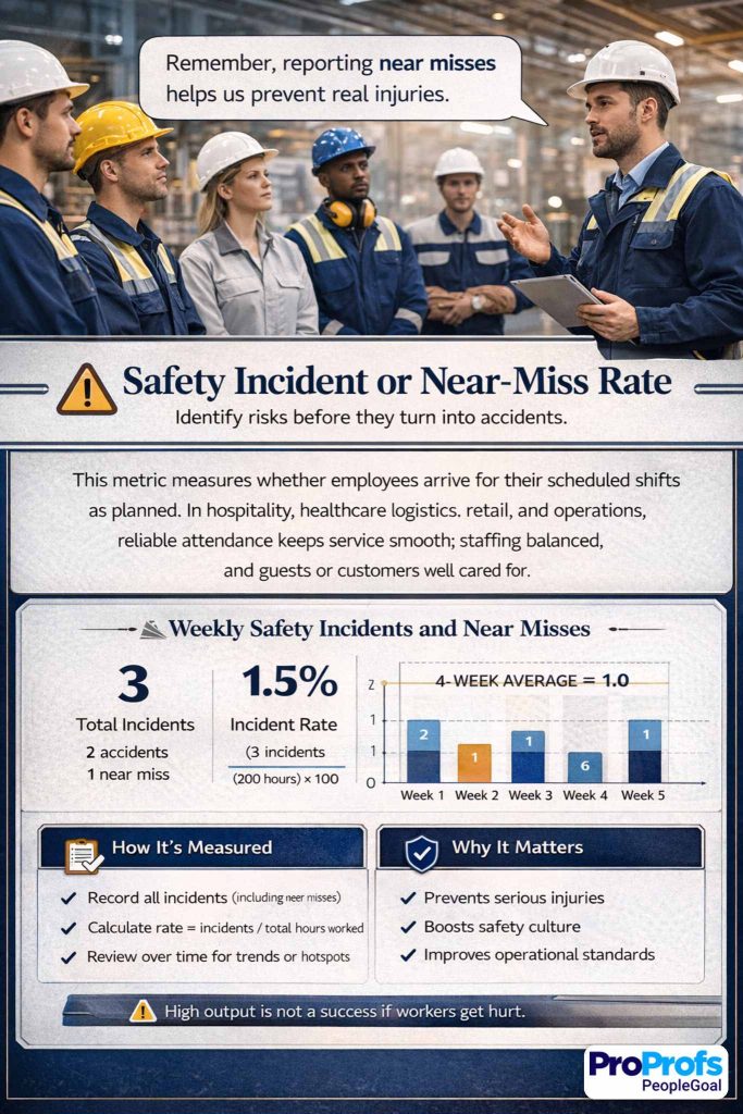
This metric matters because strong performance that creates risk is not strong performance at all.
How to calculate: Recordable incidents or near misses per employee, team, or hours worked.
How to do it well:
- Encourage reporting so the data reflects reality.
- Separate near misses, minor incidents, and serious incidents.
- Normalize by hours worked or exposure where appropriate.
- Review the conditions behind incidents, not just the count.
- Use this metric as a prevention tool, not just a disciplinary tool.
Example:
A warehouse team reports 2 near misses across 4,000 labor hours in a month. One involves an obstructed aisle, and one involves a rushed pallet turn at a blind corner. The raw number matters, but the action matters more: one incident leads to a layout fix and the other leads to revised movement guidelines during peak periods.
In strong safety cultures, near-miss reporting is a sign of maturity, not weakness, because it gives the business a chance to fix problems before someone gets hurt.
Watch out: If employees think reporting will get them blamed, the metric becomes dangerously useless.
28. Internal Mobility or Readiness Index
Internal mobility or readiness index measures whether an employee is developing toward broader responsibility, more complexity, or a future internal role. This metric is especially useful in growth-focused organizations that want to build talent instead of only buying it from outside.
How to calculate: Assess readiness against a clear next-role or next-scope rubric.
How to do it well:
- Define what readiness means with observable evidence.
- Separate current strong performance from future-role readiness.
- Use role-based criteria, not manager instinct alone.
- Reassess readiness over time rather than making one-off labels stick forever.
- Combine this metric with development actions so that it leads somewhere useful.
Example:
A coordinator is assessed against the expectations of a specialist role. The rubric looks at autonomy, decision-making, stakeholder communication, and technical process skills.
The employee is rated “ready in 6–12 months” because they already perform independently in core work, have begun handling more complex requests, and can communicate clearly with internal partners, but they still need more exposure to exception handling. That is a far more useful conversation than simply saying the person has “potential.”
Watch out: Readiness is not a promise of promotion. Keep the wording precise so expectations stay realistic.
29. Performance Trend Over Time
Performance trend over time tracks the direction of an employee’s results across multiple periods. This is one of the most valuable metrics in the whole framework because it keeps managers from overreacting to one good month or one messy week. Trends tell the real story. Snapshots often do not.
How to calculate: Compare core metric results across multiple time periods and note the direction of change.
How to do it well:
- Use at least three data points before drawing strong conclusions.
- Review trends across several metrics, not just one.
- Add context such as territory shifts, staffing changes, seasonality, or product changes.
- Look for sustained patterns, not noise.
- Use trend data in coaching conversations to focus on momentum and intervention timing.
Example: An account manager records 82% goal attainment in quarter one, 88% in quarter two, and 92% in quarter three. On its own, that upward trend looks excellent. But the manager should still ask why performance improved.
Did the employee get better at prioritizing? Did the account mix change? Did a new process or better support system help? Trend data is powerful because it shows direction, but the explanation behind the direction tells you what to reinforce.
Watch out: Never treat one weak period as a character judgment. Trend data should reduce snap judgments, not dress them up in numbers.
How Should You Create Metrics for Employee Performance Before You Track Anything?
The right way to create employee performance metrics is to start with outcomes, not dashboards. First, define what success looks like in the role, then choose a balanced set of measures that employees can influence directly, and finally set formulas, review rules, and coaching habits around them.
A metric with no logic behind it is just a number wearing a tie.
When people ask me about creating metrics for employee performance, I usually tell them to slow down for one hour before they build six months of reporting. Most measurement problems begin too late in the process, not too early. Teams jump straight to “what can we pull from the system?” when they should start with “what does good performance actually look like in this job?”
How It Works
- Define the job outcome clearly → everyone knows what “good” means before scoring begins.
- Choose 3–5 core metrics and 2–3 supporting metrics → managers focus on the few numbers that actually matter.
- Balance quantity, quality, behavior, and growth → employees cannot game one metric and ignore the rest.
- Write the formula and data source down → the metric becomes consistent and defensible.
- Set review cadence and ownership → someone actually looks at the number and acts on it.
- Use trends, not snapshots, for decisions → you reduce unfair judgments based on one bad week or one lucky month.
Here are the design rules I use most often.
| Design Rule | How to Apply It | Why It Matters |
|---|---|---|
| Relevance | Tie each metric to a real job outcome | Employees should see the logic immediately |
| Controllability | Only measure what the employee or team can influence | Uncontrollable metrics create resentment |
| Balance | Combine output with quality, behavior, and growth | This stops metric gaming |
| Simplicity | Use plain names and simple formulas | Managers need to explain the scorecard without a translator |
| Consistency | Keep definitions stable during a review cycle | People need a fair standard |
| Context | Adjust for role level, territory, seasonality, and workload | Raw numbers alone can mislead |
| Cadence | Review often enough to help, not just to document | Coaching beats surprise reviews |
| Evidence | Pair numeric data with examples and notes | Numbers tell you where to look; context tells you why |
A few practical rules matter even more than the formula.
First, do not confuse activity with performance. Sending 200 emails may or may not be good performance. It depends on response rates, conversions, quality, customer outcomes, and the role itself.
Second, do not compare roles that create value in different ways. A recruiter, a software engineer, and a support rep should not sit under one identical scorecard because that makes reporting easier.
Third, make sure every metric answers one of these questions:
- Did the employee deliver results?
- Did they deliver those results well?
- Did they work in the right way?
- Are they improving over time?
If your metric does not answer one of those four questions, it probably does not belong.
That is why I like scorecards that start small and stay sharp. A short, well-designed scorecard almost always beats a giant one.
How Do These Employee Performance Metrics Change by Use Case?
The right scorecard changes by use case because different contexts need different signals. Onboarding needs learning and speed-to-effectiveness. Compliance-heavy work needs adherence and accuracy. Employee engagement needs clarity, feedback, and follow-through.
Onboarding
For onboarding, I would prioritize training completion, skill growth, error rate, time to first independent task, and 1:1 action completion.
Why? Because a new hire is not supposed to look like a tenured top performer in week two. The goal is ramp quality, not instant heroics.
A practical onboarding scorecard might look like this:
| Metric | What Good Looks Like in Onboarding |
|---|---|
| Training completion | All mandatory learning completed on time |
| Skill growth | Clear movement from assisted to independent work |
| Error rate | Downward trend across first 30, 60, and 90 days |
| 1:1 action completion | New hire follows through on coaching actions |
| On-time delivery | Small assigned tasks delivered reliably |
Compliance
For compliance-heavy teams, I would emphasize process compliance rate, quality score, error rate, training completion, and documented evidence quality.
This is where many companies make a classic mistake: they reward speed first and hope compliance tags along behind it. It rarely does.
If the work can create legal, financial, or safety risk, compliance metrics belong in the core scorecard, not buried in a side note.
Employee Engagement
For employee engagement, I would focus less on raw output and more on the conditions that drive sustainable performance: goal clarity, feedback rhythm, 1:1 follow-through, recognition quality, and collaboration.
In other words, engagement is not some fluffy extra. It is often the early warning system for future performance trouble.
That is why I like leading indicators here. They tell you whether the environment around performance is healthy enough to produce good work later.
What Is the Difference Between Employee Performance Metrics and Performance Reviews?
Employee performance metrics are ongoing measurements. Performance reviews are periodic conversations and decisions based on those measurements plus context. Metrics supply evidence; reviews supply judgment, coaching, and next steps.
These two things get mixed up all the time.
| Area | Performance Metrics | Performance Reviews |
|---|---|---|
| Purpose | Track performance over time | Discuss performance, context, and decisions |
| Format | Numeric, observable, structured | Conversational, interpretive, documented |
| Frequency | Weekly, monthly, quarterly | Quarterly, biannual, or annual |
| Strength | Improves consistency | Adds judgment and nuance |
| Risk | Can become reductive | Can become subjective |
| Best Use | Spot trends early | Coach, calibrate, and decide fairly |
A good review should answer questions that metrics alone cannot answer.
What got in the way?
What improved?
What needs support?
What should the employee stop, start, or continue doing?
This matters because many organizations still lean too hard on the event and too lightly on the evidence. That is one reason performance reviews feel bureaucratic and unfair to so many employees, according to McKinsey’s recent research.
A review without metrics becomes opinion. Metrics without a review become cold admin.
You need both.
How Do You Roll Out Employee Performance Management Metrics Without Backfiring?
A strong performance management rollout keeps the system fair, visible, and coachable. Start small, define everything clearly, train managers, and test the scorecard before you attach major consequences to it.
Here is the rollout pattern I trust most.
- First, pilot the scorecard with one team. Do not launch company-wide because somebody got excited in a spreadsheet meeting.
- Second, publish the metric definitions. Every employee should know what gets measured, how it gets measured, when it gets reviewed, and what evidence can challenge the number.
- Third, train managers to discuss metrics like coaches, not prosecutors. McKinsey notes that more than half of respondents in its survey said their managers do not fall into the skilled-practitioner category for delivering reviews.
- Fourth, review trends before consequences. Use the first cycle to learn where the scorecard itself is weak.
- Fifth, build a challenge process. If employees believe a metric was skewed by a bad data source, system outage, territory issue, or dependency failure, they need a clean way to raise it.
A simple dashboard usually includes:
| Dashboard Layer | What It Contains |
|---|---|
| Core metrics | 3–5 role-critical measures tied to outcomes |
| Supporting metrics | 2–3 quality, behavior, or growth measures |
| Trend view | Current period plus past 2–3 periods |
| Notes | Manager context, blockers, evidence, examples |
| Action plan | Next steps, owner, and due date |
That is the part many teams miss. The dashboard should not end with a score.
It should end with an action.
What Should You Avoid When Using Metrics to Measure Employee Performance?
Avoid any metric system that rewards busyness, ignores context, or surprises employees. The point of measurement is better performance, not better intimidation.
These are the mistakes I would avoid first:
- Do not use a single number to summarize a whole human being.
- Do not compare people with different workloads or role designs without adjusting context.
- Do not attach compensation or discipline to a new metric before you validate it.
- Do not let managers invent definitions on the fly.
- Do not measure things employees cannot control.
- Do not mistake easy-to-pull data for meaningful data.
One more warning: too many companies treat employee performance metrics as if they are just admin plumbing. They are not. They shape behavior. They shape trust. They shape whether managers coach or simply score.
That is why the design matters so much.
And yes, it is more work up front.
But it saves you from a year of noisy dashboards and awkward reviews.
Turn Performance Metrics Into Better Decisions and Stronger Results
The best employee performance metrics do more than score people; they show managers where to coach, where to remove friction, and where to help great work happen more often. Start small, choose metrics employees can actually influence, and review them consistently. That is how measurement becomes improvement, not admin.
In practice, a good tool like PeopleGoal can make this easier by bringing goals, feedback, check-ins, review workflows, progress tracking, and reporting into one place.
That gives managers clearer visibility, saves time, and helps teams turn performance data into better decisions and stronger results across the organization over time as well.
Frequently Asked Questions

How Many Employee Performance Metrics Should You Track?
For most roles, track 3 to 5 core metrics and 2 to 3 supporting metrics. More than that usually creates noise and weakens coaching.
Can the Same Metrics Be Used for Every Role?
No. Different roles create value in different ways. Use common design rules across the company, but tailor the actual scorecard to the role.
How Often Should Employee Performance Metrics Be Reviewed?
Review core metrics monthly in most roles, with lighter weekly check-ins where work moves fast. Formal review conversations can happen quarterly or biannually.
What Is the Difference Between KPIs and Employee Performance Metrics?
KPIs are usually business-critical targets. Employee performance metrics are broader and may include KPIs plus quality, behavior, development, and trend measures.
Are Employee Performance Metrics Useful for Remote Teams?
Yes, but remote scorecards should focus on outcomes, quality, reliability, and collaboration rather than visible activity. Counting online presence is usually a terrible shortcut.
What Are Good Employee Performance Metrics Examples for Managers?
Good manager metrics include team goal attainment, 360 feedback, turnover trend, employee development progress, and action completion from regular 1:1s.
Ready to 3x Your Teams' Performance?
Use the best performance management software to align goals, track progress, and boost employee engagement.